This is a guest post by Lexie Lu of Design Roast.
We’re living in a time of information overload. Today’s consumer has millions of websites from which to choose, social media where they spend time and a thousand other things competing for their attention. They want a user experience that is fast, simple and to the point. After all, there is always something new to explore right around the corner.
There are nearly 2 billion websites, and the number grows by the minute. If you want to grab the attention of those who visit your site, you must focus on a simple, easy-to-use layout that provides only the essentials. Here are eight key ways simplicity wins on the web and how to make your site user-friendly.

1. Create Predictable Layouts
Users expect certain commonalities in website design. They are used to this and likely to look for specific elements in specific spots. For example, the logo is typically at the top of the page and links back to the homepage. Because this is predictable, users automatically look for the logo to navigate easily back to your homepage.
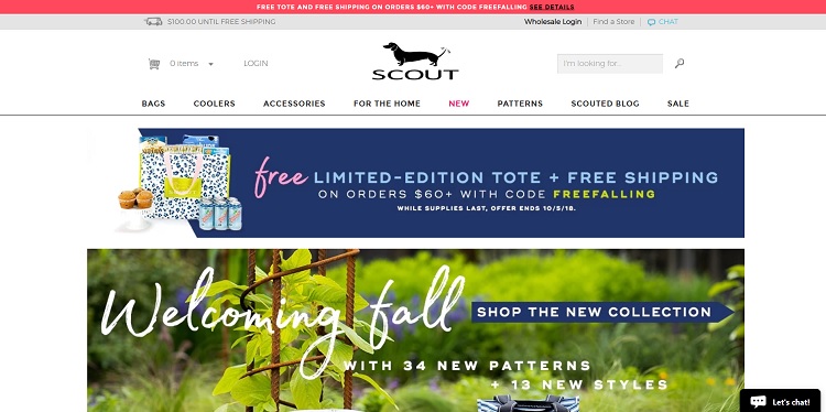
Scout sells high-quality bags, such as totes, cosmetic bags and wristlets. Note how they place their logo top center of the page in a predictable spot. The logo links to the main page of the site, so you can click on it from any page on the site and go back to home base.
2. Limit the Number of Choices
One example that perfectly illustrates how frustrating too many choices can be is the new drink dispensing machines that allow users to pick from a variety of soda types and add flavoring. The same machine dispenses ice and drinks, and users must make a series of choices to get their beverage. Most people hate these machines.
When you limit the choices a visitor has to make on your site, you increase the odds that the consumer completes the purchase or takes the action you want them to take.
3. Add a Search Feature
One way to simplify the use of your site is to add a search feature to your navigation structure. If a consumer lands on your page looking for something specific, they don’t have to browse through numerous categories and pages to find that item. All they need to do is click on the search bar, type in a descriptive phrase and go right where they need to go.
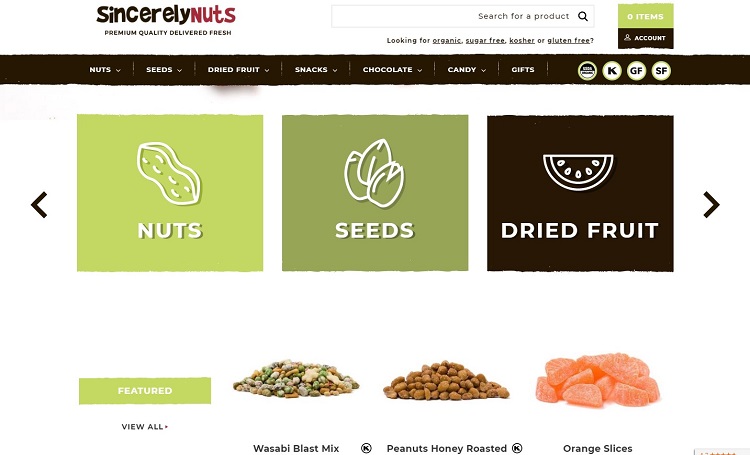
Sincerely Nuts is doing several things right, including adding featured items to make their most popular products easiest to find. However, if a consumer lands on their site and wants a specific type of nut or dried fruit, the search bar at the top provides a simple way to find any item.
4. Minimize Features
Take time to also study the products and services you’re offering. You might think adding more features draws people to buy your product over a competitor’s. However, if the features don’t add to the core function of the product, they can just complicate things and create confusion.
Perhaps the item does have a lot of features, but the way you describe them should be as simple as possible. Show features via a bulleted list, or limit the options you list to only the most important ones.
5. Limit Choices
You might offer many different products but narrowing down the choices the consumer must make upon landing on your site drives them through a sales funnel that is most likely to convert them into customers. Think about the bigger categories and how you can guide your target audiences through each step and lead them to the specific product they want.
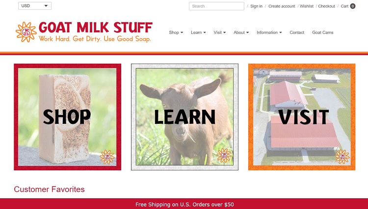
Look at the website for Goat Milk Stuff and how simple the choices on the site are. The small business offers tours of their goat farm and products made from goat milk. They break the choices down into three main categories: shop, learn and visit. If a site visitor is interested in touring the farm, the funnel takes them from the main page to information on visiting, such as baby goat experiences and farm tours.
6. Create a Usable Website
One key thing you should focus on as a website owner is how usable your site is. Take time to thoroughly test all aspects of your site. Make sure all links direct to the proper location and any buttons work. Test all forms and your shopping cart. Walk through every step of the process as though you’re a first-time visitor and make sure it all works perfectly.
7. Simplify Reports
If you run a site that curates information of any type and gives it back to the visitor, make the resulting report as simple and easy to read as possible. Word text at a readable level and have headlines, bullet points and short paragraphs. Since many of your users may be on mobile devices, make sure things are easy to scroll through.
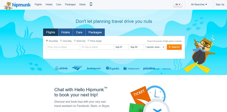
Hipmunk offers information on available flights, hotels and rental cars. Instead of popping up 15 different windows, they give the results on a single page that allows the user to compare deals easily. They simplify the search process for the user.
8. Simplify Your Design
Another way to look at streamlining your website is through the design. In recent years, flat design has trended. Images are simple, and pages are uncluttered. It allows the user to make a snap decision about where to navigate from your landing page. Limit the number of images and even how many items you have on your landing pages to keep things simple and easy to navigate.
Simplicity Wins
Ultimately, there is no reason to add unnecessary items, even if they are aesthetically pleasing. Look at every element on your website and ask whether it serves the goals of the site, or whether you should remove it to keep the focus on the product and the action you want users to take.
 Lexie is a graphic designer and typography enthusiast. She owns and manages Design Roast. Follow her on Twitter @lexieludesigner.

