
This is a guest post by designer Lexie Lu of Design Roast.
A Call to Action (CTA) is an instruction to consumers that tells them exactly what to do. Maybe you’ve studied CTAs and know the importance of using them on your website and in your advertising, but getting CTAs to convert isn’t always that simple. Some fall flat, and it can be challenging to figure out why.
CTA buttons are a crucial factor in your overall marketing equation. Fortunately, there are some fundamental changes you can make to help your CTAs convert better and gain more attention. Here are nine reasons your CTAs aren’t converting, as well as how you can fix the problem.
1. Not Using First Person
In formal writing, first person is a no-no. However, copy for a website, newsletter or social media is much less formal. In one case study, the company saw a 90 percent increase in click-throughsby changing to first person wording.
In this particular case, they changed from “start your free 30-day trial” to “start my free 30-day trial.” First person makes the offer personal and allows the visitor to see exactly what they should do next. To fix this issue on your site, convert second person or third person phrasing to first person. Use words such as “I,” “my” and “mine.”

Snappa has a strong, first-person call to action on their landing page — note the wording of “create my graphic now.” The response they want from the user is clear.
2. Choosing the Wrong Color
There are many different schools of thought about what color a CTA button should be. Some people swear red is the only color to use, while other people believe blue garners the best results. The truth is that the color should depend on a variety of factors, including the overall color scheme of your page.
To fix this issue, take the time to conduct A/B testing — try different color choices for your CTA button and see which one converts best.
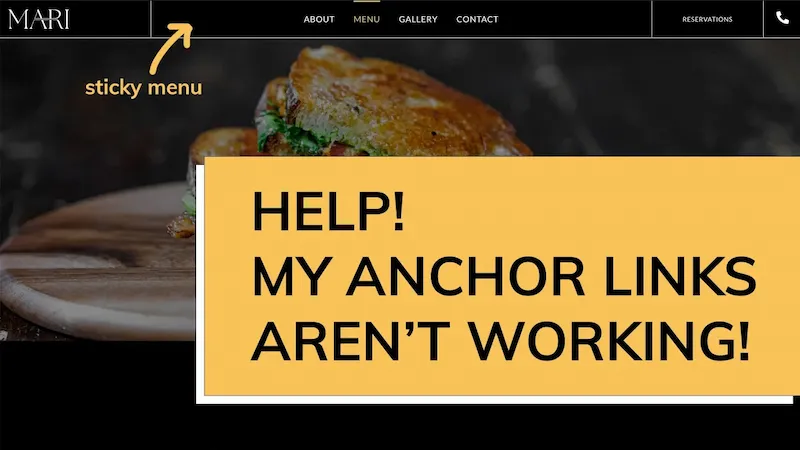
3. Failing to Make the CTA Sticky
Is your CTA easy to find no matter where the user goes on the page? Even if your tests show that the CTA converts better when placed at the bottom of information, you should always provide a CTA that is a quick click. Someone who comes to your site to take advantage of the offer doesn’t want to scroll through endless info to get there.
Fix this problem by creating a smaller CTA that lives in your navigation bar at the top of your page or near the top of your sidebar.
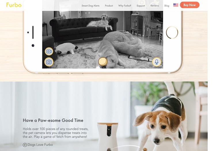
Note how Furbo places their CTA button in the sticky navigation bar at the top of the page. As the user scrolls through the information on the page, that navigation bar travels with them. This makes the CTA of “Buy Now” always visible. If the user decides to order before visiting the website, they don’t have to hunt for the opportunity to do so.
4. Using Weak Verbs
Are you using a strong, action verb in your CTA? Some words create more of an urgent message than others. The wording of your CTA has a significant impact on your overall conversion rates. Take the time to seek out words that are powerful enough to grab site visitors’ attention.
Fix this issue by looking at which words have more of a powerful punch. For example, “Get a free newsletter” versus “Grab a free newsletter now.” Take the time to test different phrasing and find the best fit for your audience.
5. Staying Neutral
Does your site offer something personal to the site visitor? People crave the individualized touch in an ever-increasing neutral world where they seem like just another number. If you’re treating your site visitors as “the masses,” then you’re failing to create a personalized experience.
Fix this by putting yourself in the site visitor’s shoes. How can you make the experience more personal for every person who lands on your page?
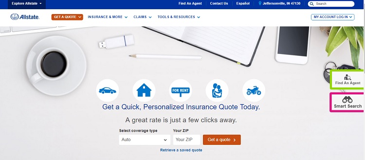
Allstate does an excellent job standing out from the competition. Any insurance company offers a free quote, but they stress that theirs is “quick and personalized.”
6. Placement Is Horrendous
The location of your CTA button affects how well it performs. Even though schools of thought indicate you should place it above the fold, below the fold or in the header, it’s hard to know which is correct for your site. Do you put the button to the right, the left or to the center of the page?
There isn’t a one-size-fits-all answer to this problem. Instead, you must look at the overall aesthetics of your page and figure out the best placement. Then, do some testing to see which location becomes a hot spot on your heat map.
7. Missing Contrast
If the user can’t see your call to action, then it’s going to be difficult for them to take that action. Your CTA button must contrast with the background it resides on. To get users to click on the button, it must be something that grabs the attention. If it doesn’t heavily contrast, it won’t draw the eye.
To fix this issue, try out different color combinations and see which one pops on the page. Pull in the opinions of others if you aren’t sure.
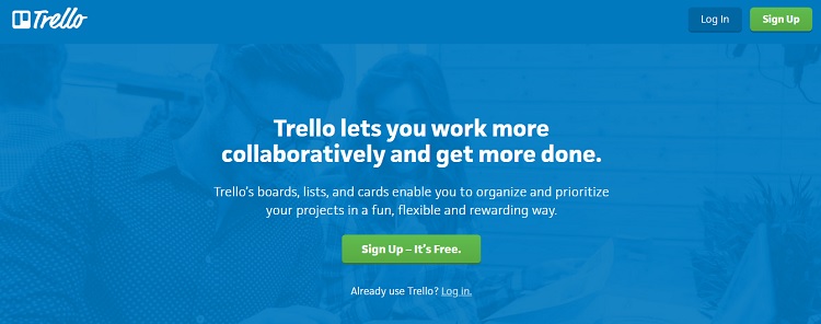
Trello uses a shade of green that pops on the blue background. While you might find blue and green to be similar, the tones used here have a different enough hue to create that stark contrast needed in a CTA button.
8. Contains Only Text
If your button contains only text, you may be missing an essential element that drives conversions. In one study of Helzberg Diamonds, they saw a 26 percent increase in clickthrough rates by adding an arrow icon to their CTAs. That’s a simple change that resulted in maximum impact.
While missing arrows might not be exactly a problem area, it is something you can test to see if it helps your CTAs convert higher. Simply add an arrow icon to your CTAs and see what happens.
9. Adding Clutter to the Page
Over time, it’s easy for a page to gain more information. However, this also creates clutter on the page and makes it difficult to find the CTA. For example, Open Mile was able to increase their conversions by 232 percent by removing clutter from around their CTA button.
Take the time to look over your page and see if it is too busy around the CTA. Does anything draw the eye other than the CTA button? Remove as much clutter as you can from the page.
Creating CTAs That Convert
We’ve studied nine significant main reasons why your CTAs aren’t converting well and how best to fix these issues. The next step is to try out different words, colors and offers until you find the perfect mix that turns browsers into leads. With a little attention to detail, you’ll be amazed at how much better your CTAs convert.
About The Author
 Lexie is a graphic designer and typography enthusiast. She owns and manages Design Roast. Follow her on Twitter @lexieludesigner.


