When planning your web design, the most important thing to keep in mind is your users. If you give your users what they want, they’ll fall in love with your site and with you! Here are 10 things people want to see on your website.
Watch the video!
1. A Clear Explanation of What you Do
There is nothing more frustrating than scrolling through a website and not having a clear idea of what the company does. When visitors land on your site, they should know what you do immediately. People are busy. If they can’t get a clear explanation of what you’re all about instantly, they’ll probably just leave. Including a short, clear explanation at the top of your home page will let people know whether or not they are in the right place.
2. Easy Navigation
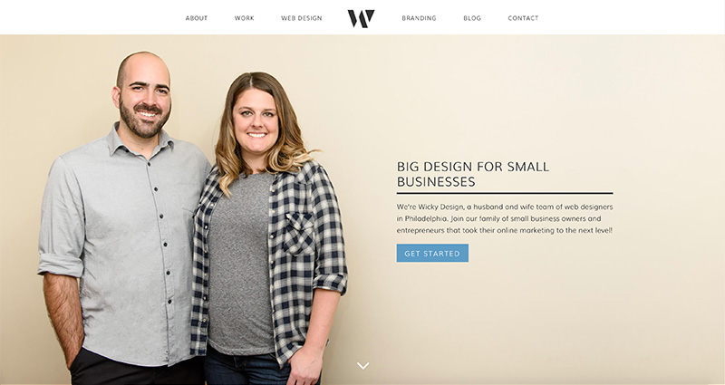
When it comes to navigation, it’s always best to keep it simple and give people what they expect. Getting fancy with names of pages might just confuse users. Call your about page “about” instead of “my story” or “journey”.
3. Testimonials
People love seeing social proof that you know what you’re doing. Including testimonials is a great way to establish credibility and put people’s minds at ease. Pepper in testimonials throughout the pages of your site, include product reviews or even link to outside review sources to help establish yourself as reputable.

4. An Updated Blog
Blogging is a great way to update users on your latest happenings, share industry news and establish yourself as an expert, but it only works if you keep it updated. Landing on a blog that hasn’t been updated in a year gives an impression that nothing is going on within your company. If you can’t commit to updating your blog regularly, don’t have it on your site.
5. Options For Contacting
Giving people multiple options to contact you satisfies the personal preference of your individual users. Some people prefer email, while others like phone or social media. Multiple options to get in touch gives people more reason to reach out.
6. Your Story
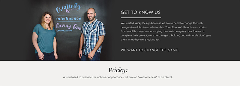
People like buying from companies they feel a connection with, which is why an about page with your story is an essential part of your website. Let people know who you are and why you started your business. If your users can relate to you, they will be more likely to buy from you.
7. Clear Pricing
If you’re selling something, the first concern your users will have is the cost, so make sure it’s clear and upfront on your website. This may sound obvious, but I’ve seen a number of sites that bury their prices beneath lengthy descriptions and fluff that I never read. If your users have to scroll forever to find the price of your product, they could get frustrated and end up leaving. Keep it simple.
8. A High Quality Description
Since people can’t physically touch your product online, descriptions are incredibly important. Be detailed and give as much information as possible so your users know what they are buying. Things to include:
- Sizing
- Materials used
- Product dimensions
- Weight
- Colors
- Shipping and delivery info
- Return policy
9. High Quality Photos
Photos will make or break your website. If your images aren’t high quality, it’s time to invest in them. Whether you invest the time to take them yourself or hire a professional photographer, you can’t skimp out on your images. People get so much more information from images than they do from words, so good photography will go a long way.
10. Policy Explanations
Give your customers peace of mind by making your policies on returns and exchanges easy to find. Instead of burying them in the footer of your site, include them on your product pages. Not only will this make you more transparent, a good policy may actually encourage people to buy.
A well designed website gives users what they are looking for. Is your site giving users what they want?
Need help redesigning your website? Sign up for our free website evaluation!
