2020 is almost over (thank god) and it’s time to start thinking about your marketing goals and planning for the new year. For a lot of businesses, that means updating their websites.
Today, I’m going to go over 5 easy things you can do today to make your website look more polished and professional for 2021.
Enter Our Holiday Website Giveaway!
1. Use a custom email address
It’s time to stop using your gmail account and get yourself an email for your business. Using yourname@yourdomain.com looks way more professional and legitimate than using your gmail, yahoo, or any other free service.
Services like Office 365 or GSuite are inexpensive and easy to set up and give you a lot more features than just an email. We personally use GSuite, which gives us access to Google Docs, Sheets, Meetings and a bunch of other tools that we use every day.
Related Article: How to add Custom Emails to your Gmail Inbox
2. Add A Site Icon
A site icon, or favicon, is that little icon that shows up in your browser tab when you visit a webpage. This icon helps establish your website’s identity and provides a better user experience. A lot of times, your website’s host will provide their own site icon, but you do have the ability to customize it for your brand. And you should. This is something that you might not think is a big deal, like, ehh, no one will even notice. But this is something that a lot of people, including myself, notice immediately and can be changed pretty easily.
If you have a WordPress site, this can easily be changed by going to Appearance >customize. Click on general settings, then go to site identity and upload your icon there.
3. Use White Space
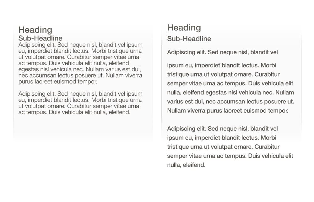
Good use of white space will instantly make your site look more professional. When everything is crammed together and on top of each other, it makes your site a lot harder to read.

When you give elements some breathing room, your site will look more polished and professional.
4. Edit your content
The long paragraphs of content need to go. No one wants to read all of that. Instead, edit your content so you get your point across in as few words as possible and design your page around that content.
What I recommend is writing down everything in a word document, editing that document, then going back and editing it again. What you’ll be left with is only the important stuff.
Break up your content into scannable sections so it’s easier to read. I like to break things up by using headings, images, fonts, and colors to help reinforce the words on the page. When your intentional about where you place your content, it helps make your site look much more professional.
5. Ditch the selfies and stock photos
If you want to look legitimate, professional images go a long way. Ditch the selfies and the cheesy stock photos and invest in some good photography for your website.
Now, I get it. Not everyone has the budget to hire a professional photographer. But that doesn’t mean you should settle for bad photos. Use what you have until you can hire someone.
If you’re going to DIY your photos, pay attention to lighting, set the stage with props, and have someone else take your picture instead of doing the selfie angle. You may even want to consider downloading a photo editing app like Lightroom to do some basic editing.
Related Video: The Best $400 we Spent on our Business
Those are my 5 tips to get a more professional looking website in 2021. If you’re looking to take your website to the next level, schedule a free consultation call with us.


