Your website’s design impacts the overall customer experience (CX) of your site visitors. There are only so many controllable elements on a typical web page. Navigation is a must and users expect a familiar feeling layout. Your client may also require the use of specific colors based on the company’s color palette. One way of adding interest is with the choice of typography in your design.
In one online study, analysts found a mere 20 percent of readers finish an article, and the average person reads only 25 percent. You have a short period to grab the reader and keep their attention. Typography creates a visually pleasing aesthetic that pulls users in and keeps them on your page. It also serves as an indicator of main ideas as the user scans down your page.
There are many ways typography impacts web design and improves CX.
1. Adds Visual Interest
Do you ever feel as though every page you visit looks almost the same? Some themes and layouts are so popular that originality disappears. Typography is your opportunity for creativity. Grab interest from the minute the user lands on your page with big, bold typography.
A recent trend utilizes typography for the name of the business rather than a logo. A name header still shows the personality of the brand but allows the instant user recognition of the company name.
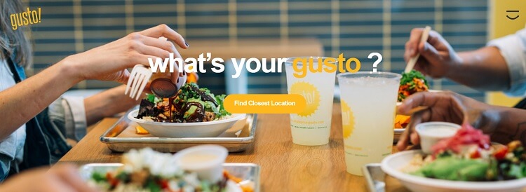
What’s Your Gusto utilizes beautiful typography and engages the user from the moment they land on the website. In the example above, animated typography grabs interest as the last of the three words changes. Words such as passion, gusto, verve, flavor, taste, oomph and passion appear. From the minute the user lands on the page, the questions play in their mind, driving the imagination.
2. Finds Current Trends
Kinetic typography is a recent trend in design where parts of the words or letters move around in a pattern and settle into the word or phrase. Kinetic typography appears as video often accompanied by music. Kinetics create a story to the words, making them more potent than plain text. Educational industries embraced kinetic typography, but any business benefits from the type which tells a story more powerfully.
Trends change from year to year, so study current trends and add elements into your type designs.
3. Creates Symmetry
The best typography has a pattern to it that creates symmetry. Designers use typography to draw the consumer’s eye where they want it to go and draw attention to the images on the page. When you use big, bold illustrations, the typography may fade slightly into the background. However, it still needs to be bold enough to draw the attention of site visitors. Good typography requires balancing font with all the other elements on the page. The only way you learn balance is through designing as often as possible, making mistakes and learning from them.
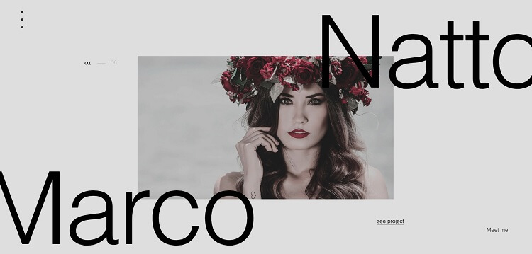
Victor Costa’s designs utilize typography which allows the image to peak through and remain the central focus of the page. The typography meshes with the image, almost appearing as part of the photo at times. The letters create balance to an otherwise blank canvas.
4. Connects Emotionally
Utilize unique decorative fonts for emotional connections with customers. A floral touch adds romance to letters, while thick letters look more like casual street art. Think about the emotional connection you’d like to make with your target audience and find a font matching that mood.
Use decorative fonts sparingly, though, as they tend to draw user attention. For example, you may want user attention drawn to the call to action button and not the page title. A landing page is a good location for decorative typography but using the same design on every page is overwhelming.
5. Creates a Hierarchy
The typography on your site generates a hierarchy for users, pointing them toward the areas you want them to visit and showing which elements on your page are of most importance. A good typography plan includes different fonts, different sizes, bolding, italics and accents.
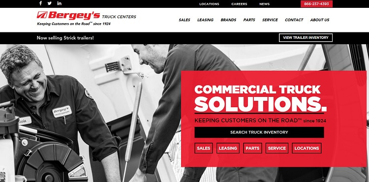
Bergey’s Truck Centers has a gorgeous typographic hierarchy that draws site visitors’ attention to vital elements on the page. Note the big, bold typography in white letting site visitors know the company offers “commercial truck solutions.” Then, the navigation is in a different color and bold italics. The structure and varying height of the letters draws the eye and creates a map for navigating the website easily.
6. Shows Important Elements
One of the great things about typography is getting creative with its usage. For example, one of the current trends with typography is cutout typography, where letters appear over a background or a background peaks through large letters. Look at your page from different angles and figure out ways of creating hidden meaning and multiple purposes for maximum impact. When a site visitor sees an excellent use of negative and positive space, they are more likely to remember your website.
7. Sets the Mood
Set the mood of your page through the colors, fonts and even arrangement of typography. Create a fun, fresh vibe with bright colors and trendy uses of type. On the other hand, you can use a standard font, such as Arial in your typography for a more traditional look and choose colors such as navy or black for a serious tone. Typography and the elements used to highlight typography set the entire mood of your page.
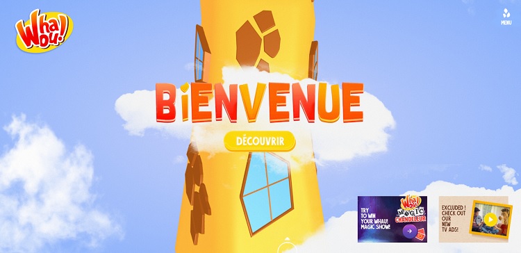
Whaou! is a fun, engaging brand aimed at youth. There are games on the site and fun activities. Note the use of bright ombre colors for the type and the bubble letter look, which is reminiscent of animation. The entire design screams fun and engaging. The mood is youthful.
Vital Part of Design
Typography is one of the essential elements of any design. The type must match the rest of your design and the personality of the brand, but it also gives you an opportunity to stand out from competitors. Completely change the impact of your designs and the customer experience with creative and smart uses of typography.
 Lexie is a graphic designer and typography enthusiast. She owns and manages Design Roast. Follow her on Twitter @lexieludesigner.